Wedding Design Assets
Eva & Emilio
Print | Digital
I collaborated closely with a private client (bride and groom) to design and execute a comprehensive suite of print and digital assets for their wedding, establishing a distinct brand identity that was consistent across all touchpoints. The goal was to translate their personal aesthetic and cultural heritage into sophisticated, cohesive visual materials.
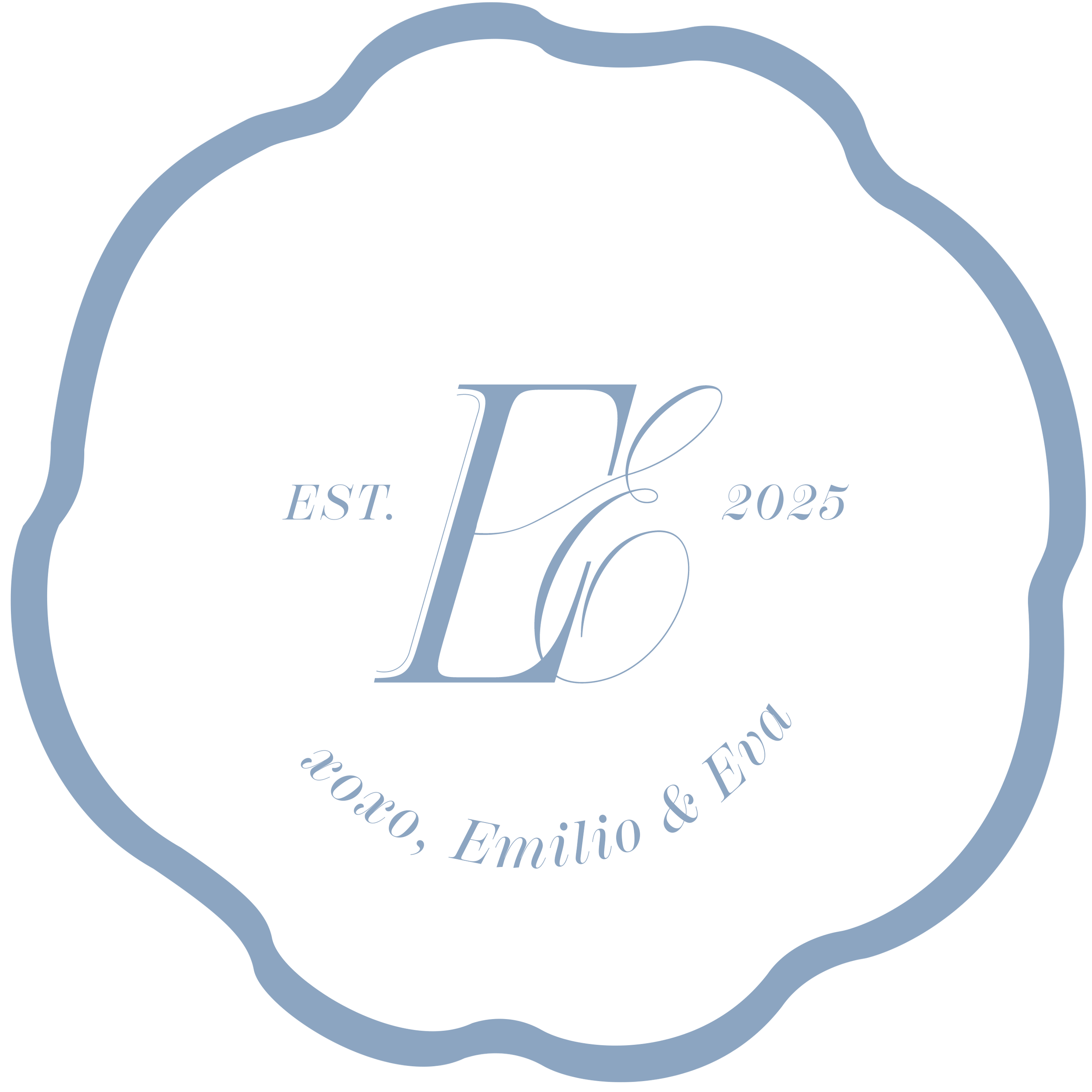
The project began with a discovery phase to define the couple's unique color scheme and brand voice. A custom logo was developed that served as the core visual anchor for all subsequent materials, ensuring a refined and recognizable identity.
The primary creative challenge was to respectfully and beautifully incorporate design elements reflecting the client's Mexican roots, specifically drawing inspiration from Talavera tile and ceramic vases—a request that elevated the design beyond standard event collateral. I translated the intricate patterns and vibrant colors of Talavera into modern, usable graphic motifs for the stationery and digital interfaces.
Technical Execution:
Venue Illustrations: I used Procreate to illustrate each unique wedding venue, creating custom, hand-drawn assets for the wedding itinerary and maps, adding a deeply personal and artistic touch.
Print and Digital Asset Production: All supporting assets (invitations, signage, digital RSVPs, etc.) were finalized and prepped for production using industry-standard tools: Adobe Illustrator for vector graphics and layout precision, and Adobe Photoshop for image manipulation and digital mockups.
Weekend Itinerary
For this summer wedding, the goal was to create a truly one-of-a-kind guest experience. I individually illustrated each venue location using Procreate, ensuring every step of the itinerary was unique and visually cohesive.
To bring the seasonal vision to life, I chose a linen textured paper stock that added a high-quality, tactile dimension and perfectly complemented the summer aesthetic.


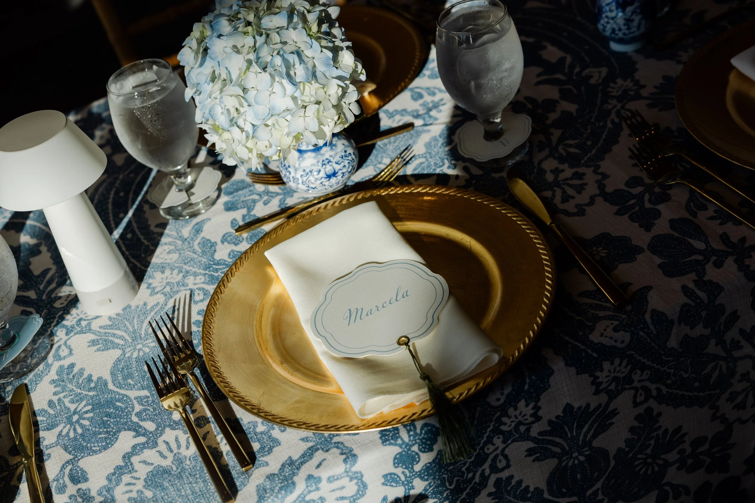
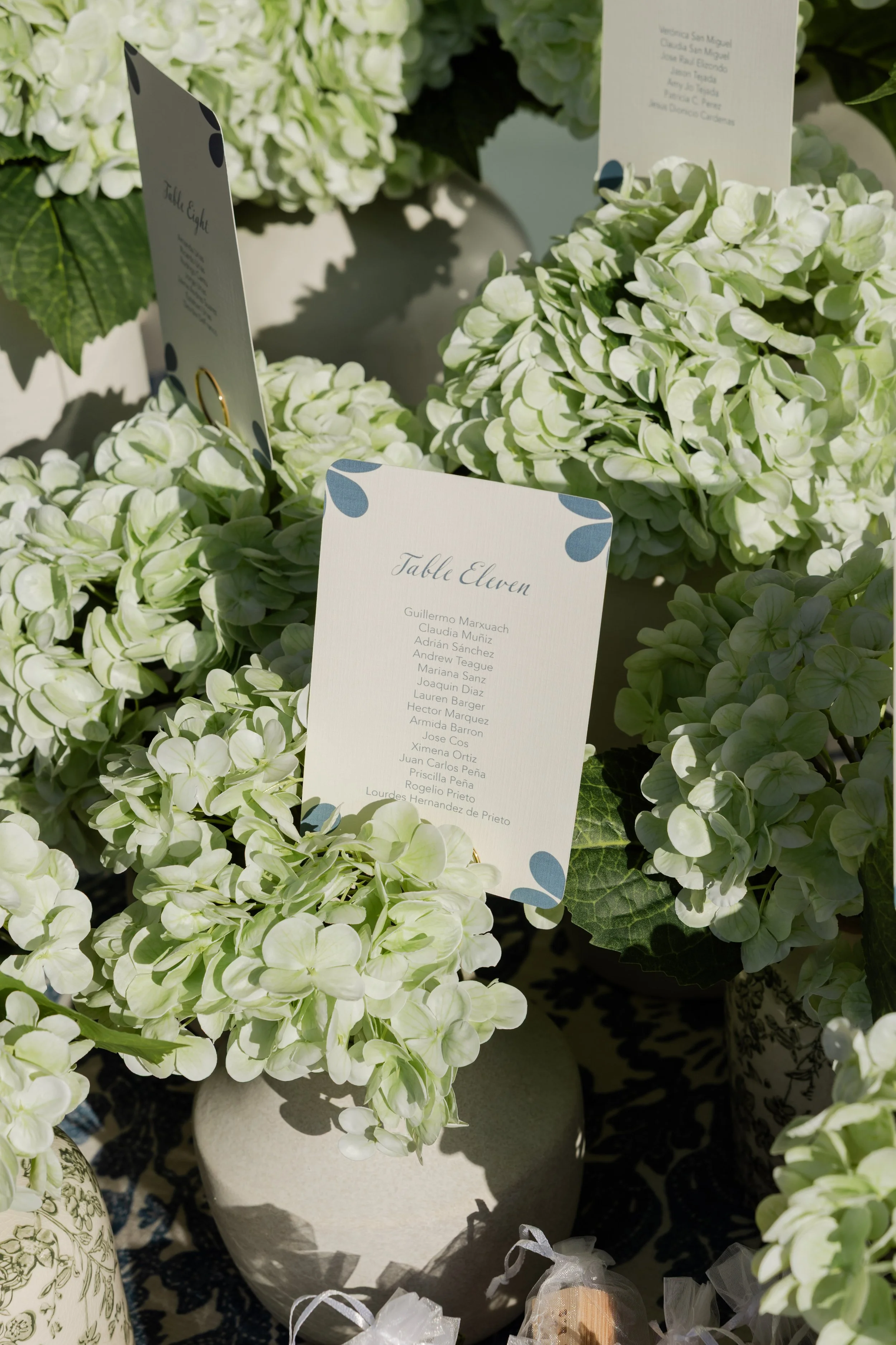
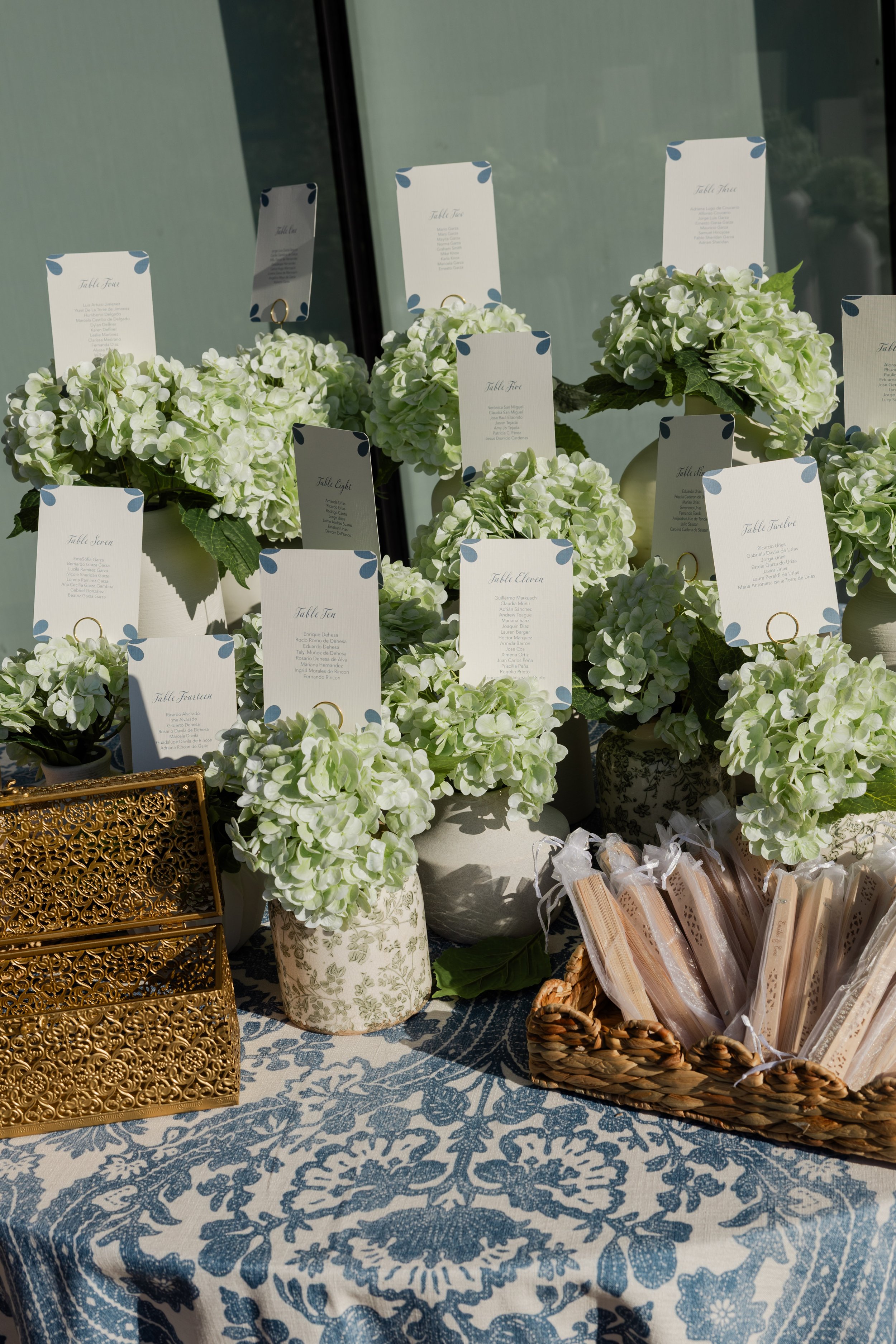
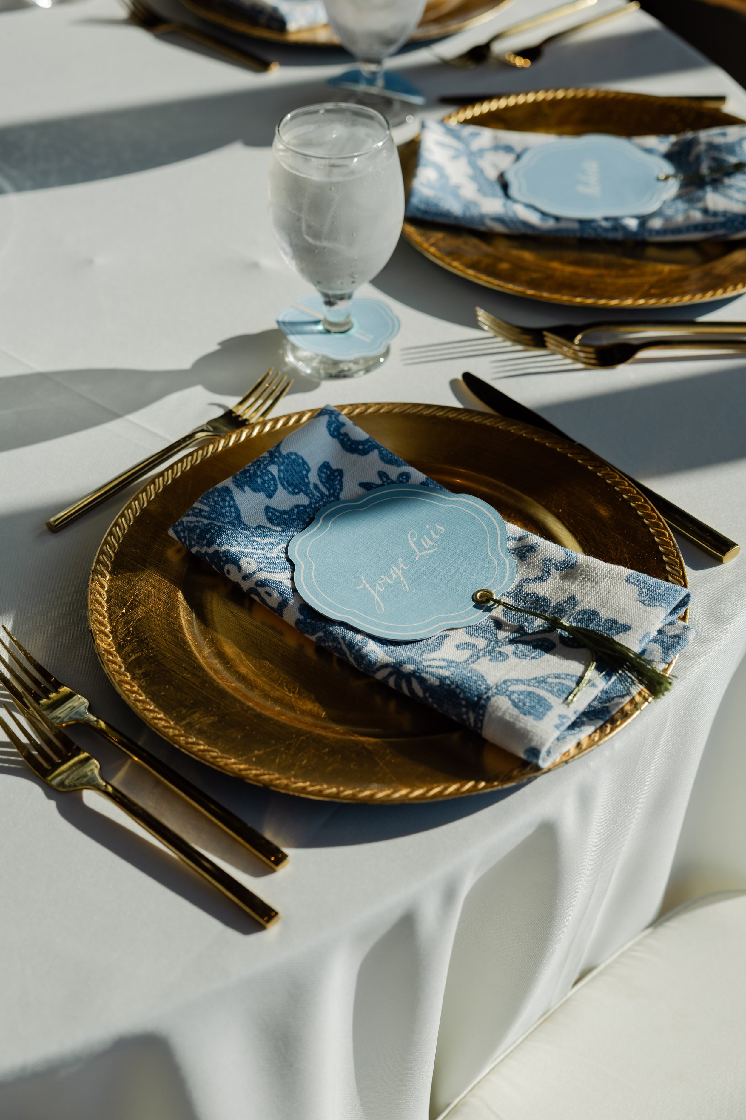
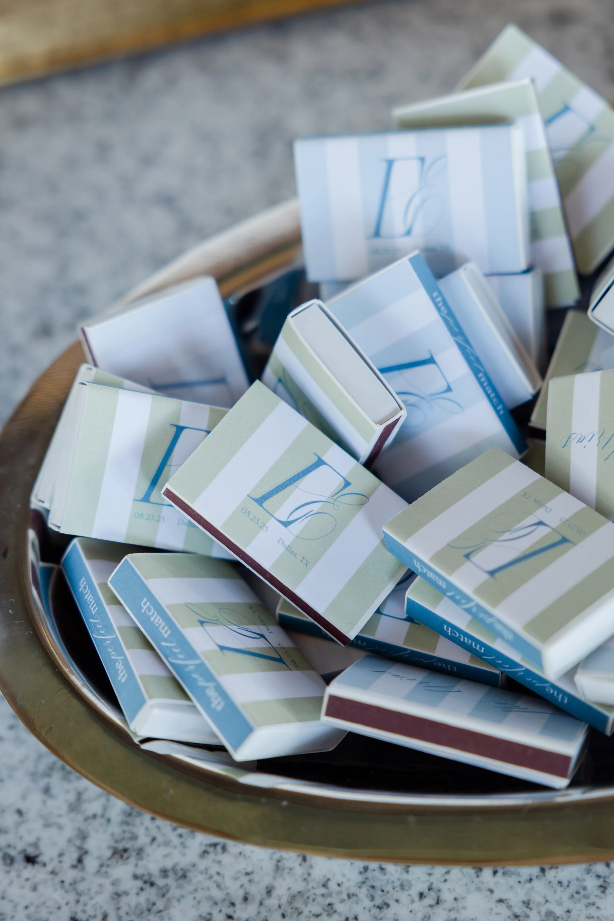
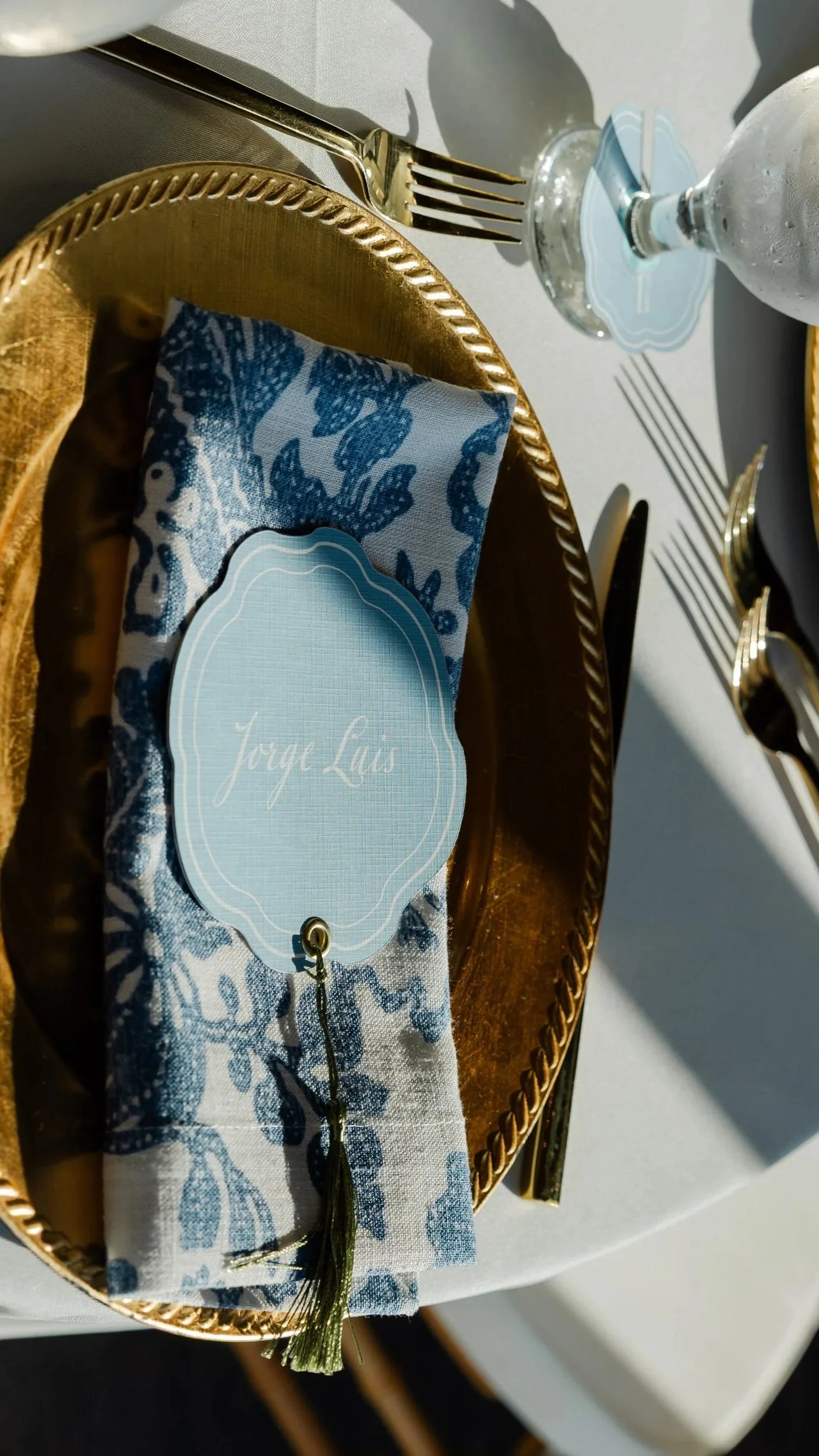
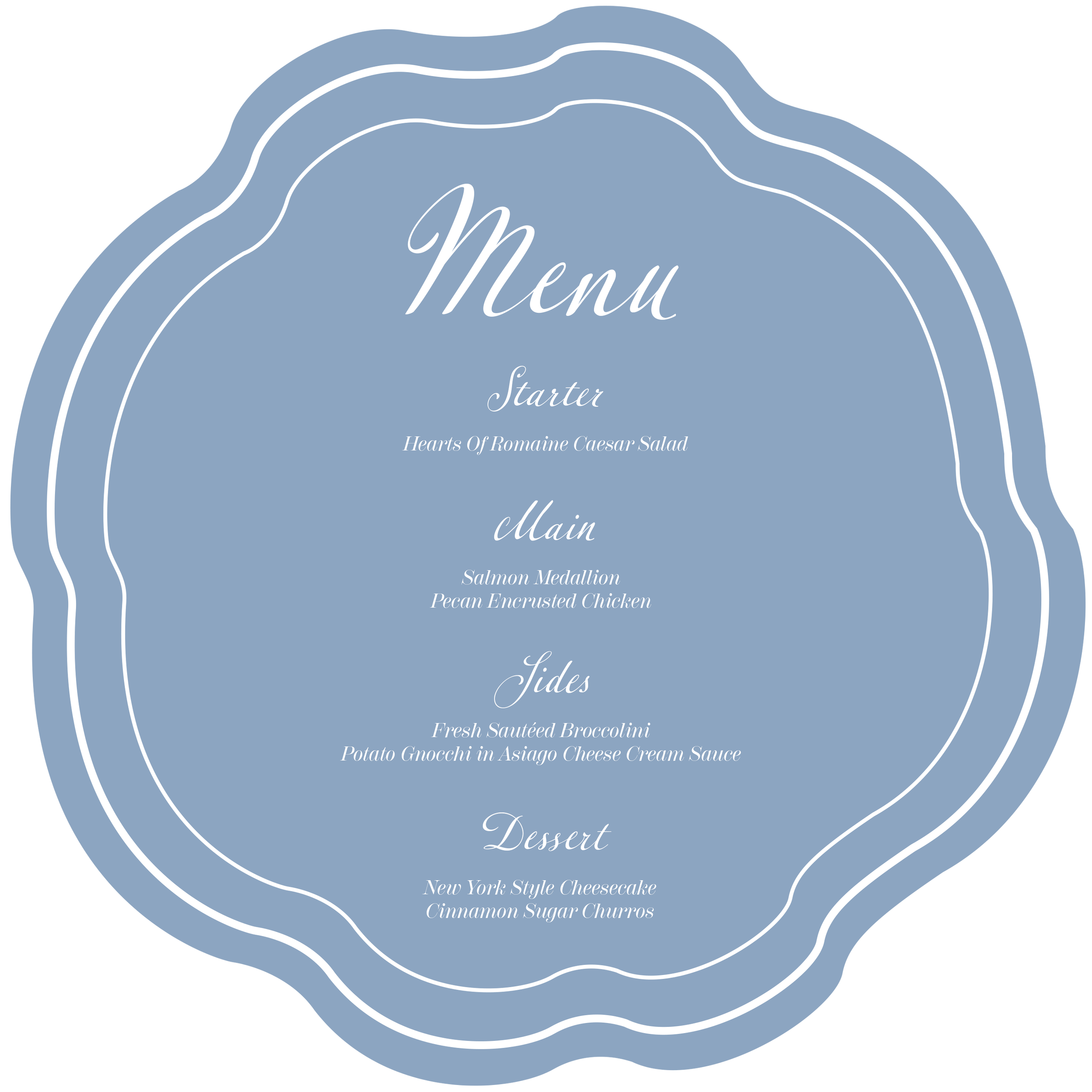
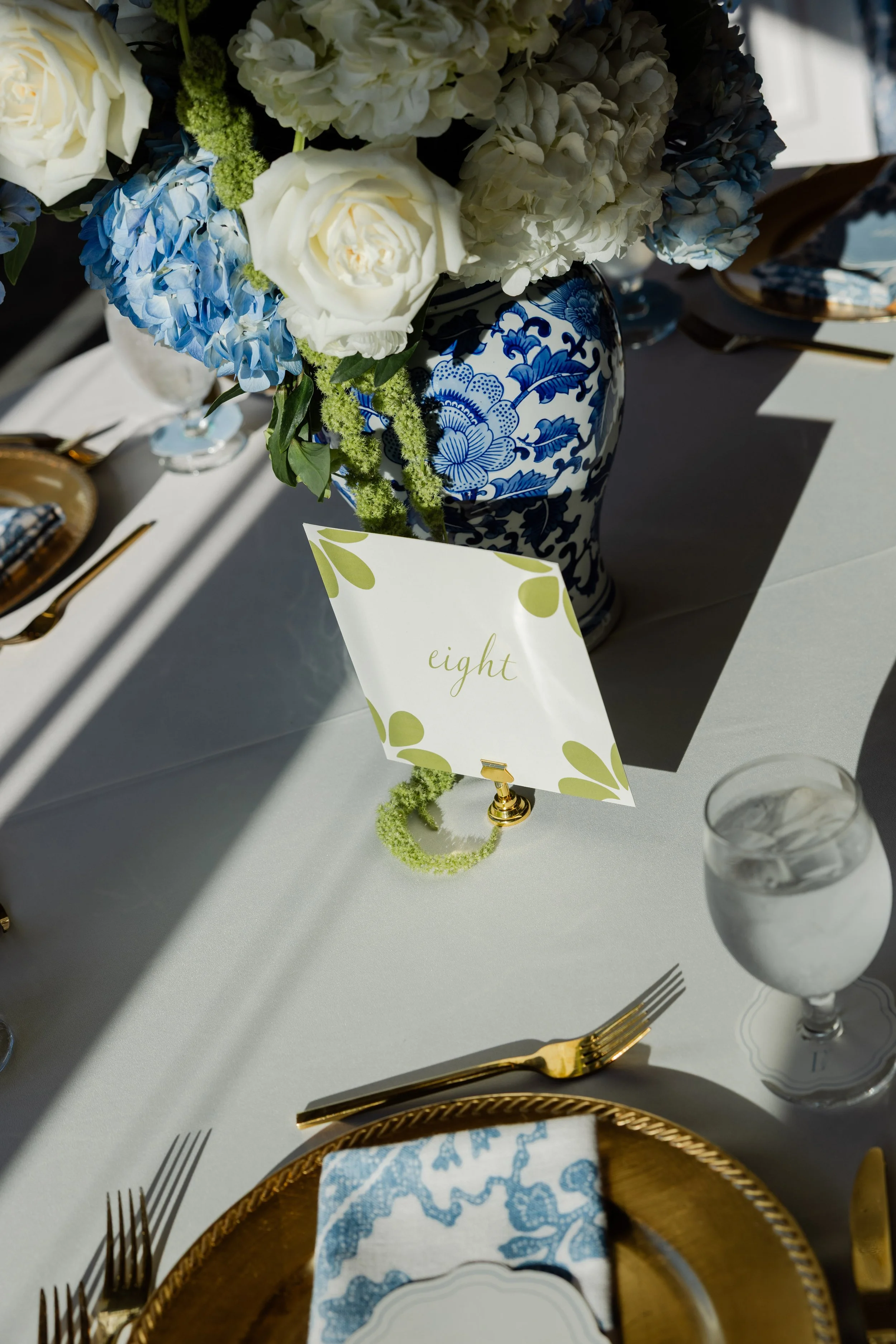
Table Components | Place Cards, Menus, Glass Skirts, Table Numbers
To complement the floral decor, the menus and place cards were designed in a unique shape alluding to the hydrangea petals. The final production delivered both beauty and crucial functionality for the catering team: blue menus designated the fish entree, while cream menus indicated the chicken entree, allowing servers to instantly identify each guest's meal choice. A delicate gold clasp attached the menu to the name card, allowing the set to open and close gracefully, mimicking the unfolding of a flower.
This comprehensive vision extended to the stemware, where a simple wine/water glass skirt in coordinating colors, complete with the couple’s custom logo, ensured every detail on the table reinforced the personalized brand of the wedding.
I used the wedding's accent green for the table numbers to create high contrast and easy recognition against the blue and white decor. Each sign was subtly detailed with Talavera tile patterns, seamlessly linking the navigational element with the overall tabletop design theme. Function and beauty, hand-in-hand.

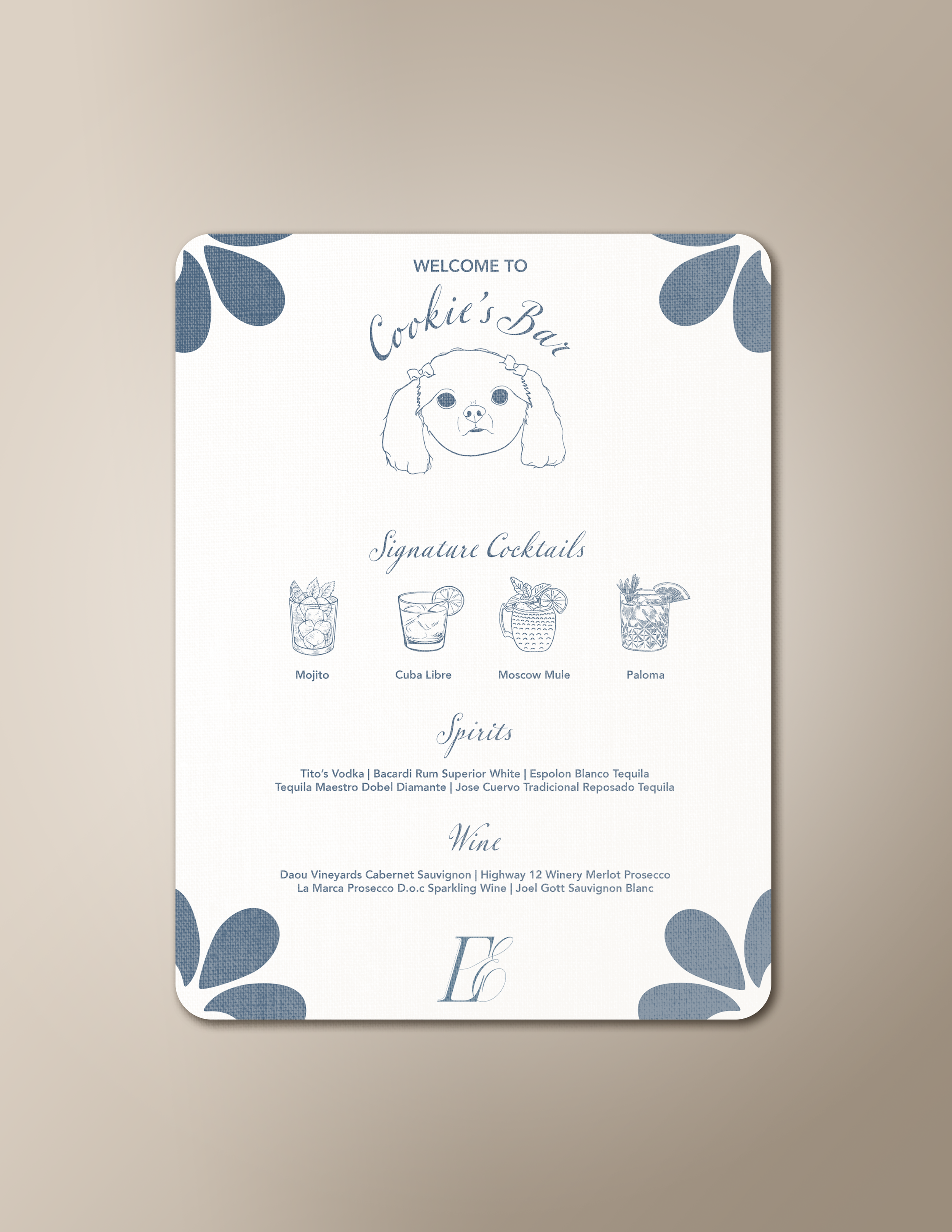
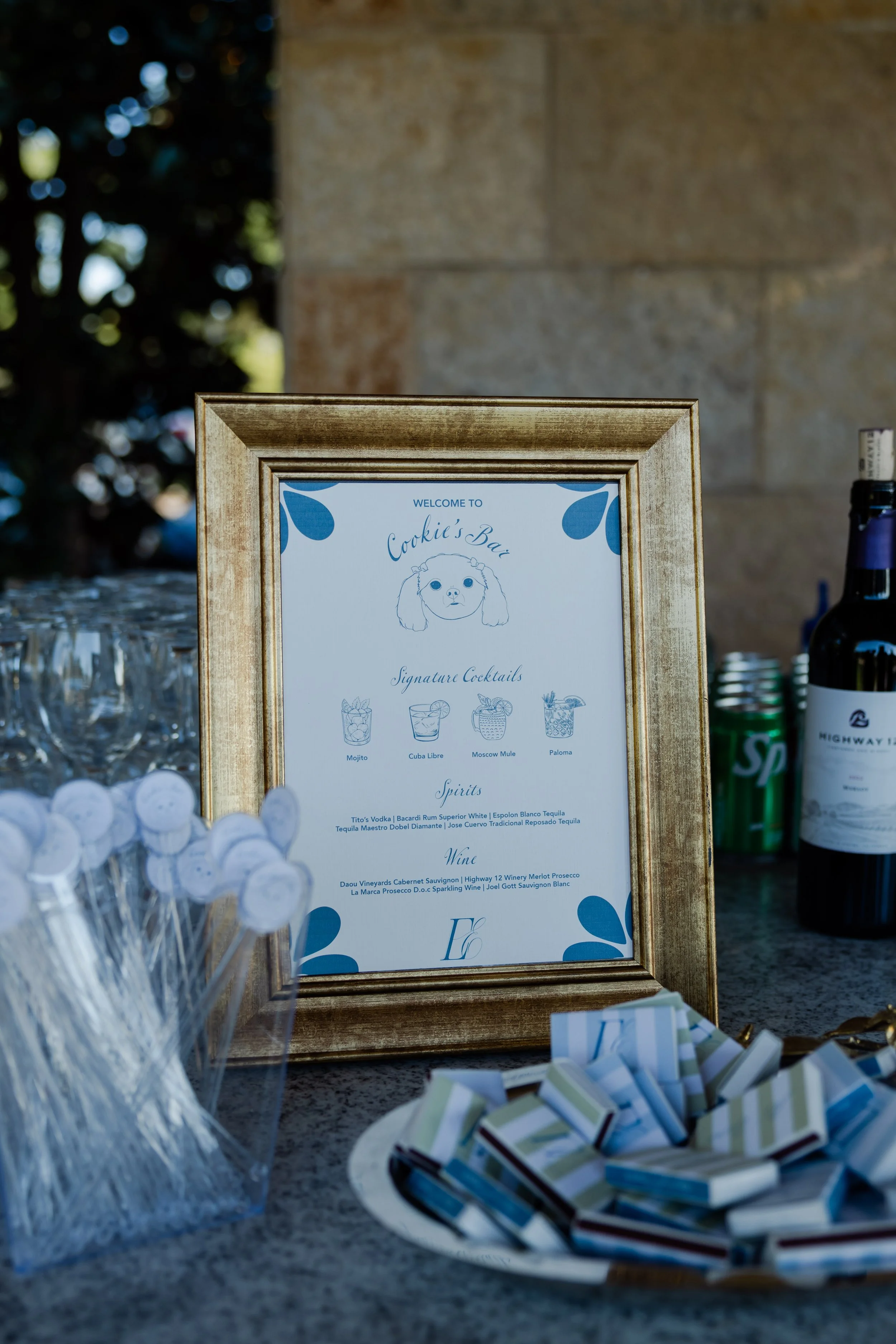
Bar Menu & Stir Sticks
The bar menu was designed as a unique and heartfelt tribute, named "Cookie’s Bar" after the couple's dog. To make it a true piece of bespoke art, I created a hand-drawn illustration of Cookie to anchor the design. The entire menu adhered strictly to the wedding's established colors and fonts and was accented with subtle Talavera tile motifs, ensuring this personal touch felt completely cohesive and integrated with the overall elegant aesthetic of the reception.
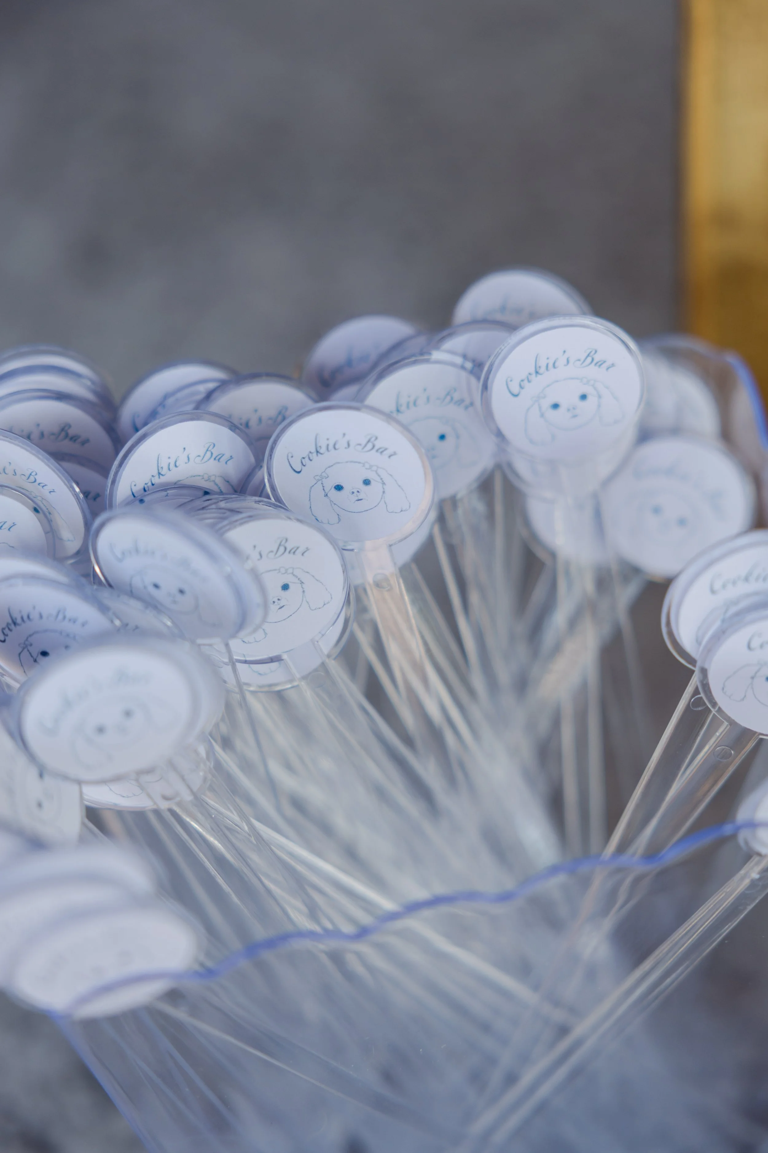
To extend the personalized branding and guarantee high visibility, we custom-designed stir sticks featuring their dogs face. This detail was intentional: it ensured the feeling that the family dog was a part of everyone's evening. Placing the branding on such a frequently photographed item guaranteed the couple's custom, playful detail would be captured in countless celebratory photos and elevate every single cocktail served.
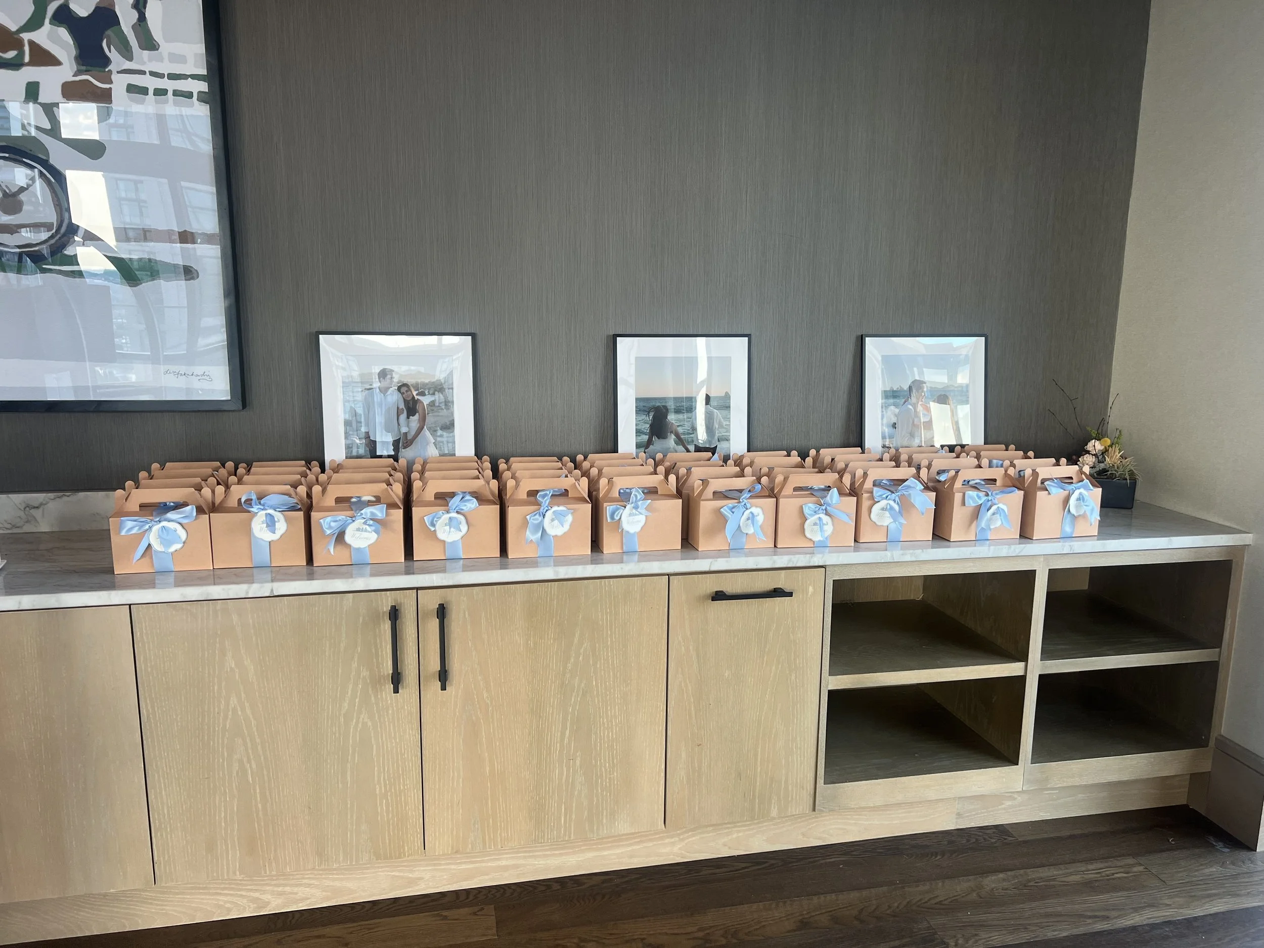
Welcome Cards
To establish the personalized tone for the weekend, welcome cards were attached to the night-before gift bags. The card was designed to be a two-sided keepsake: one side prominently featured the couple's logo, immediately reinforcing the wedding's established brand identity. The reverse side showcased a custom illustration of the Dallas skyline, commemorating the city where the couple met and held their celebration.
This functional piece of stationery also ensured visual continuity. The card incorporated the distinctive petal shape of the hydrangea used on the reception place cards, subtly linking the pre-event touchpoint with the formal dinner setting. This deliberate focus on cohesion and intentional design meant guests received a personalized, memorable greeting that perfectly aligned with the high-quality, branded experience of the wedding.